Thursday, December 15, 2011

Brand New


Brand New

Is it true there is no such thing as a good idea? This brief is an exploration of that theory. 

There is no such thing as a new idea. It is impossible. We simply take a lot of old ideas and put them into a sort of mental kaleidoscope. We give them a turn and they make new and curious combinations. We keep on turning and making new combinations indefinitely; but they are the same old pieces of colored glass that have been in use through all the ages.
-
Mark Twain

The idea that there are no new ideas is naturally a concerning one in the graphic design industry or in any creative industry when it comes down to it. In an age were the film industry is frequantly remaking old films (Footloose, The Italian Job and The Karate kid to name but a few) are we as designers just re-hashing old ideas. This can be true of anything - you can link almost everything back to something that existed before. For example, the vacuum cleaner was designed as an improvement of a carpet sweeper, and both came orginally from a simple twig broom. 


Orginally for this project I was going to dissprove everyone elses new design ideas. However, on contacting my fellow students nobody was keen to share their ideas with me (mis-placed fear I would steal them/pull them apart in the crit session) or hadnt come up with a new idea themselves. So I decided to look at the process of creating, how that has changed, and if advancements in techonolgy have made a difference. 

For the first part of my project I used Adobe Ideas in my ipad to draw out some of the most seminal inventions including birth control, the printing press, batterys and the microwave. I then arranged this together in a collage using Adobe Illustrator. This probably took around four hours.
 

I then went out and brought an embroidary wheel, some thread, a few needles and some calico fabric. My plan was to re-make the collage i'd created in Adobe Illustrator. I sketched out the images and then set about embroidaring them. It turns out that embroidary are hard. I spent around 18 hours doing this and I was making such slow progree. I decided to give in - there may not be any new ideas, only shifts in techonolgy, but sometimes these shifts can be benificial. The embroidary did look good, but not for the amount of time it was taking me. 

Friday, November 18, 2011

Circus of Sound

Circus of Sound

Circus of Sound is an avant-garde project to bring new music to young people, based on the works of contempory performers, as well as a mix of rediscovered composers from previous centuries. The project was to create an in-house typographic style and a series of typograms for a variety of artists.

This project was about applying an appropriate typographic style, that would be suitable for a broad range of musicians. I started my project in the usual way, researching each of the artists in an attempt to get a better understanding of them. I very rarely listen to instrumental only music, particularly of the classic variety, and therefore found all the works and listened to them to see if that would help formulate any ideas. The artists for the project were:

  • Astor Piazzolla (1921-92)
  • William Byrd (1543-1623)
  • Gyorgy Ligetti (1923-)
  • Somei Satoh (1947-)
  • Talvin Singh (1970-)
  • Moses Taiwa Molelekwa (1973-2001)
  • Canlon Nancarrow (1912-2001)
  • Howard Skempton (1947-)
  • John Dowland (1563-1626)
  • John Cage (1912-1992)
  • Charles Ives (1874-1954)
  • Ivana Ognjanovic (1971-)
The music in question ranged from music from the renassiance by William Byrd, performed on instruments such as a Lute to the talba playing Talvin Singh who created an innovative fusion of Indian Classical Music and drum and bass.


As there were such a variety of styles I decided to really focus in on the word Circus. It may have been a slight cliche but the composers could be a variety of the circus animals, and the circus and tent a representation of the 'Circus of Sound' grouping of these particular arists. I researched old fashioned circus posters, found a template for the CD that could be made by folding and gluing, and not relying on plastic casing, something that would not have been in keeping with the majority of the times from the composers.


I choose a typeface called Communist for the front cover of the C.D's - it was sans-serif and easy to read and when I reduced the kerning so that the letters were all touching together (but not too merged together) this gave a space within the composition name to insert the name of the composer. For the rest of the text I used a font called Averia Serif. It wads traditional without being anquiated, and seemed in keeping with the theme from the old circus posters. The 'Circus of Sound' tag was created using a type appropriatly called Circus. I wanted the composers all the link together but be visually clear that they were seperate, so I kept the design of each CD the same and simply changed the colour, making sure their were bright and alluring.


The C.Ds were all to be displayed in a circus tent CD holder that could be rotated around with each c.d's - thus bringing them together in a "Circus of Sound".


Sunday, October 30, 2011

"Quotes Poster"

"Quotes Poster"

 An 'out of the hat' quote. Design a poster, billboard and a t-shirt.

For this project we were given a quote and told to design from that. I got given one by Sharon Stone:

"Women might be able to fake orgasms, but men can fake whole relationships".


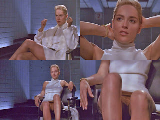
 Whenever I get given project the first thing I do is my research - I can not design unless I am properly informed about the subject matter. Sharon Stone is an actress, model and producer, perhaps best known for her role in Basic Instinct and Casino, for which she won a golden globe. She is someone who may be considered overtly sexual and has on occasions been known to have a tenuous link with the truth. For example, her role playing the bisexual serial killer Catherine Tremell containted a notorious scene where she is being interogated by police offices. She is sitting with her legs crossed, un-cross's them, spreads her legs and reveals she is wearing no underwear, then recrosses them. All whilst smoking a cigarette. She plays it overtly cool, never flinching, a female seeming wholly in control. It was one of the first bits of full-frontal nudity in film history and gained her a certain leval of notority. However, she later denied she was aware of the nudity, saying:

"I knew that we were going to do this leg crossing thing, but i did not think you would see my vagina in the scene - I was shocked".

The director of the film, Joe Eszterhas, said otherwise, stating .."she was fully aware".


This was a repeated pattern over the years, with people such as the Dali Lama claiming she was a liar. She has also stated she is a member of Mensa, although this has not been verified. To get a broader view of Sharon Stone I also collected some other quotes:

"A woman has many faces as she goes through her life. It's like we need more than one hair-do. We have many, many changes in the evolution of our lives. We have, we learn, and we grow; we view life differently, and life views us differently."

"At first it was exhilarating but when I realized it wasn't going away, it became scary and claustrophobic. Fame is a weird thing."

"Ava Gardner was the most beautiful woman in the world, and it's wonderful that she didn't cut up her face. She addressed aging by picking up her chin and receiving the light in a better way. And she looked like a woman. She never tried to look like a girl."

"Before I was a year old I walked and talked and I was even potty trained. When I started going to school I think I got on everyone's nerves because I used to ask adult questions rather than settle for the stuff usually fed to kids."

I wanted my poster to evoke a sort of old hollywood glamour, and even though it was purely typographical, be synonomous with the quoter. In the end, for the poster I choose a typeface called Dream Orphans that I felt wouldnt look out of place in some film credits, and arranged the words as if there were legs crossing over.


For the billboard I kept with the Black and White theme and this time, although not explicity allowed by the brief, added an image. To me, doing a billboard poster about a film star without an image of said film star seemed odd - afterall, film stars careers are wholly based on their images. I there included a sultry looking pose of Sharon, alterend to monochrome, and stated a few facts on the opposite side of the image. I wanted the poster to show the side of Sharon that was perhaps untruthfull.


The t-shirt design, which in the crit someone pointed out would be so much more appropriate on a white pair of underwear, I put the word 'fake' in the middle of the spreadness. This was to make a comment on how sexuality in cinema is quite often the complete opposite of what actual sex is life. Sex on film is impressive - artfully tousled hair, full face of make-up, simultanious multiple orgasms. Sex in real life is real - great, but sometimes funny, and often messy. If we all had a fictional film sex life, I imagine life would be a lot less fraught!

To accompany this project I also made a book that included images of Sharon Stone and various quotes to give a more well rounded view of her. 

Friday, October 14, 2011

Ten Ideas for an Internet Youth TV Station

Ten Ideas for an Internet Youth TV Station

Decided a title - pick a theme and style, consider branding, content, corporate ID, demographic

The first of this years projects was to design an internet TV station, aimed at a youth audience. The first thing I had to do was find out what an Internet TV station actually was - and despite haranguing the lecturer - couldnt get a substantive answer. After some research (on the internet) it seemed to me internet TV stations were things like BBC IPlayer, MTV Videos etc. So how to transfer this into an interesting TV station idea? I brainstormed the following ideas:

  1. Can't Cook? Can Cook! - Student cooking site - with everything from how to boil an egg to how to cook on a tight budget. Easy to follow videos. 
  2. Student Union TV - Forum for student concerns with a relevant authority to discuss
  3. Come Hang for Ten - A platform for not broadly televised sports, giving accessabilty to a wider audience
  4. I'm with the Band - Independant music platform for unsigned bands - but from a friends recommendation
  5. Every Goal's our goal - Never miss a goal, try, putt again. A website showing only the actual action of a sports game. 
  6. Rampent Ranting - A forum for all the rightous and opinionated out there who need a platform to let it all out. 
  7. Zombacolypse - A survival website in the event of a Zombie Apocolypse
  8. Tadpoles Den - For young entrepernuers - much in the style of Dragon's Den
  9. Cut and Paste - An ongoing project, creating a story from submissions in a variety of differnt mediums
  10. Revolution around the World - Young peoples hopes and fears for their cultures - a comparison between different issues that are subjective to each situation. 

I decided to focus on the Zombacolypse Website as I felt this was perhaps the most interesting and I didn't want to do anything to do with a talent competition (I blame X-Factor for the decline in original ideas in Media). It came to mind as my friends and I have spent many hours speculating on the best course of action in the event of such a disaster. It was always hypothetical but after frequant discussions I felt I could perhaps impart some advice. To get my project off the ground I did some broad research on the subject matter, researching different historical information including quotes taken from religious texts that could be interpreted as pre-luding to the raising of the dead. For example:

"And the lord will send a plague on all the nations that fought against Jerusalm. Their people will become like walking corpses, their flesh rotting away. Zechariah 14:13"

I also read some fictional works to help prepare me for my website, including both World War Z and How to Survive the Zombie Apocolypse by Max Brooks. Of course, a research into a zombie survival site could not be completed without watching films such as '28 Days Later', 'Dawn of the Dead' and 'Aaah, Zombies'. I think the Zombie genre endures because of humans natual thrill at gore, and our own morbidity, and also the self belief when watching films like this that we would do things differently, we would be smarter and we would survive. 


My website needed to be informative, visually attractive, and have factors that would be attractive to an outsider. Nearly all Zombie films used the colours black and red so I designer my website around those colours. I took images of Zombies and civillians from a variety of films and outlined them in black, sometimes adding a splash of colour that would give a nod the the film they came from. For example, on the page referencing Film and Literature I had drawn an blacked out image of the character JIm from 28 Days later in his iconic green scrubs (if you are unfamiler with the film the story focuses on Jim, portrayed by Cillian Murphy, and how he awakes from a coma to find zombies have taken over england).


The website was split into five sections - About, History, Science, Film and Literature, Survival. The aim of the website was to have various "experts in their field" to give advice on what to do in an event of a Zombie Apocolypse. I wanted David Starkey to give a history, and had people like Ray Mears and Bear Grylls giving survival advice. The website was designed in a slight 'tongue in cheek style' but obviously with the hope that it would be of actual use in the unlikely (or likely in some peoples opinion!) event that Zombies take over the world.The full website is shown below: