Monday, April 30, 2012

What is Graphic Design?

What is Graphic Design?

Write a brief that defines what you consider graphic design to be. Describe clearly what it's aims and outcomes are. Once written produce that brief.

Graphic design can be a variety of different things - advertising, identity (logos and branding), publications (magazines, newspapers, and books), advertisements and product packaging. It should communicate to everyone, and where-as fine-art can be subjective, graphic design should be clear. We had to create our own briefs to try and show what we think Graphic Design is. For me to get a broader understanding and the different types of design I first made a typographical poster containing lots of different quotes of what design actually is, using a variety of fonts. Reading these quotes gave me a better understanding of what design was and helped me when I wrote my project brief. 


"When you break it down into single parts, we do book jackets, we do record covers, we do logo designs, it sounds really dry, it sounds really dull, and I think a lot of people don’t quite realise how much it touches on their lives or the subconscious pleasures it can give or the subconscious ease it can bring to their life." Huw Morgan - Graphic Thought Facility

For fun I also created a poster poking fun at the graphic designer musts: Thick rimmed glasses, pantone items, negative space etc:

For me, graphic design is sometimes doing something you don't want to do. You need to be paid, and sometimes you can't just design quirky posters for art gallery openings. Therefore my brief was this:

Graphic Design is sometimes doing something that you don't like, campaigning for someone you loath, or advertising a product that you know is rubbish. With this in mind, pick a topic you dislike and creative both a postive campaign, and a negative campaign, preferably only shifting the design slightly. 

When designing for political parties I wanted to show sometimes you have to ignore your own political views and try and promote your candidate in the best possible light. I used images of each of the MP's eating (except for Theresa May so I found one of her grimacing) as I prefer natural looking shots over styalzied forced pictures. I also think, from the perspective of a polictical campaign, that shots of someone eating make the M.P's (an often out of touch breed) seem more human. I sketched out images of each of my chosen candidates, and imposed them on a posters using the Tory blue for the Conservatives and Red for Labour. It's amazing how a pithy slogan and colour can completely change the political backing. 


Thursday, April 19, 2012

Impressions of London

Impressions of London

A visual and typographic essay

I moved to London two years ago to move in with my partner and to be closer to the university. I knew that living in London would be different to my comparitivly small town in Sussex. I grew up in a Village outside the new town Crawley where everyone knew each others business and the patrons of the local pub where I worked all had their own glasses. In a way it was stifiling - everyone I knew who hadnt gone to university were setting up home with their partners and working in office jobs - and after frequanting the same two pubs in the town centre, and the one club, I knew it was time for a change. 

Moving to London was going to be a shock to my system but I felt an exciting one. My partner lived opposite the Olympic Stadium in Bow and I had friends in Bethnal Green and Brick lane. I pictured myself in cooler clothes, drinking in Brick Lane every night with a cosmpolitan selection of artists and eccentrics. But after the first summer my priorites started to change, and the urban bleakness of the old industrial estate where my flat was based began to grate on me. I began dreaming of surburbia, of a local pub - not an overpriced gin and tonic bar, and places to walk to at the weekend. This apparently is not an infrequant occurance - I call it the London Cycle.

I decided to base my visual postcards of London on this - making light of the cliche's that happen when people move, and the change in views as the years go by. I wanted to use photographic images of London with my own drawings on top of them. I was inspired by 'fashion dolls' - cut out paper dolls that you could put paper clothes on top of in any style you desired. I drew the images with black outline and left them white, leaving the sender free to personalise their cards for their own means. 


My postcards follow the story of a young girl moving to London. With an assortmant of suitcases and no furniture, she moves to trendy East London to escape her country life. Shopping on brick lane, only buying "vintage" clothes, she hopes to be photographed for 'Dazed and Confused' or similar. She gets a job working as a runner for a television production company, earning minimum wage to collect coffee's and try and source increasingly bizzare lists of items. Eventually the bills from the retro clothes shopping start to fill up, so she takes a job as a Personal Assistant in 'The City', telling herself its just for now and she's going to leave these corporate arseholes soon and act/write a book/become a artist. However she soon get's used to the money, and the people aren't really that bad. Now those nights out are becoming less regular because who wants to queue at a bar for half an hour for a £17.50 gin and tonic when they could pop to the local offliceance for a bottle of red instead? No, she'd rather spend her money at the amazing Borough Market and have her friends over for a few bottles of wine and a home cooked meal instead. At least they can hear each other now. Eventually East London becomes too expensive, she's paying £1200 a month for a one bedroom studio apparment. Some tree's would be nice, and a pub she can walk to for a sunday roast. So she moves to a place in Kent, where she can sit out in the garden and grow some vegetables.

The story is a mixture of my experiences of moving to London, and my partners. I see it happening to some of my friends, and I thought this really gave a personal view of the London experience.
 

Friday, March 2, 2012

Mirrors

Mirrors 

Our homes are mirrors of ourselves - produce a visual discription of your home. 

To start this project we had to first make a list of our associations of our homes. I moved from my parents house in Sussex, into a flat with my boyfriend and also another flatmate in East London, and then a flat with my just my partner in West London. During this time I also had my parents move out of my childhood home, where I had reigned for 22 years, into a new property, in the same town, but to one where I had no memories. 

My list for the property I was then living in was for my flat in East London:

Balcony:
1 dead plant - now ashtray
1 view of Olympic Stadium (irritation)
Occasional peeping Tom

Living Room:
Coffee Table - formally a cardboard box with red blanket thrown over the top, now high-tech slidey black table from Dwell. A life advancement. 
Said Carboard box used to contain the TV. The TV is a monster, 52" and is the focal point of the whole flat.
Playstation - main stay of any house with men living there
Home phone: Recant acqusition - the only people who have the number are my parents and my grandparents. 
2 Chairs, ripped leather, "rescued" from the Bin Store on the ground floor 
2 sofas - navy blue from IKEA these came with the flat

The flat is open plan but we have seperated the kitchen and living room via a large black shelving unit, containing all our DVD's and books. Included in the books are Philosphy text books (flatmate Ben's degree) American History textbooks (partners degree) and graphic design books.

Kitchen:
Wooden stand alone table - this is my domain so covered in spices, rock salt, chopping board, recipe books
Coffee machine - no coffee pods. A gift from another couple for our new home (we are shortly moving)
Microwave - Before I moved in this sat broken for two years as they couldnt be bothered to replace the fuse. I sorted within 2 weeks. 
Kettle and toaster - donated by my parents
Oven - filthy
Dishwasher - never used. Broken and smelly.
A variety of kitsch cooking equipment - it's ok to be a female cook as long as you do it in an ironic way.

Bathroom:
Flatmates - disgusting.

Dining Room:
Rarely used glass dining table and a selection of board games. I am at the age where scrabble and a few bottles of nice red is much more appealing than a night out at Fabric (or similar). 

My bedroom:
Double bed - lumpy pillows and sheets
Bookcase - covered in a variety of items that don't seem to fit anywhere else including replica wrestling belt (partners) and Barbie and Ken dolls (mine)
Two wardrobes and two chest of drawers - literally bursting with clothes despite regular clear outs. 


What this rather pathetic list shows is that home is, and forgive me for this, really where the heart is. None of the above was really important to me at all - I loved that flat because it was the first place I lived with my partner, because of smoking and drinking red wine on the balcony, having parties in the open space and spending all day in bed when I was too hungover to go out (and had no parental influence looking on dissaprovingly. I therefore created my poster as a timeline of events that happened in the various places I've lived. It was the events that left me nostalgic for the places I've moved on from, not a broken microwave. 


Friday, February 17, 2012

A disaster waiting to happen

A disaster waiting to happen

Big or small/personal or global. This project is about causing consternation and anxiety among the populous. It can be reactionary or be subtly understated. Your project will contain a solution to the problem that arrises. 

One of my favourite types of literature is one that portrays a dystopian future, therefore a project that is about future disasters was something I felt naturally at home with. From 1984 by George Orwell, to Brave New World by Aldous Huxley, and The Man in the High Castle by Philip K Dick, my fascination with a future that has gone so wildly wrong is boundless. Most recantly I read Cormac McCarthy's 'The Road'. The Road is a story of a father and son travelling accross a wasteland that is scorched and nearly berifit of all life, after some either natural or man made disaster. One particular scene really resonated with me; the father and son had found an empty house, and set about searching it for food. They noticed a cellar door in the kitchen, and on opening it, found a collection of humans being kept prisoner, some with body parts hacked off but still alive, all emaciated. These humans were being kept as a food source by a cannibal gang. This particular scene really resonated with me - would I resort to the same tactics if I was starving - at what point does that become something you feel is acceptable to do? 


Cannibalism is something that used to be fairly widespread until around the 19th Century is parts of the South Pacific and tropical Africa. In Melanesia there was instances of indigenous flesh-markets. More recantly is has occured in wars in Liberia and Congo although this was strenuously condemned. The only known tribes that are believed to carry on the practice are the Korowai and some Melanesian tribes. This got me to thinking about what would happen if natural food sources started to fun out? If we couldnt synthasise some sort of tenable alternative would we start harvesting humans? And who would the first to go. 

Of course, as with most things, if someone saw profit it in, it would natually turn into a business, and be marketed to seem a much more socially acceptable thing to do. And who would naturally be behind this than the symbol of all corporate greed and evil, but everyones favourite fast food restaurent McDonalds.It already has thay "I shouldnt, but I want to appeal" so would therefore easily make the natural transference into human meat. 

I turned this idea into three difference posters and a book aimed at children to the nursery rhymes 'Old McDonald had a farm'. The posters all carry a the distinctive brilliant reds and bright yellow from their own branding, and depecit Ronald McDonald holding a finger and human heart, a dissection of the human body as if it was food (normally done when showing the different cuts of beef available) and a re-hased 'Happy Meal' with tongue burger, finger fries and a blood milkshake. Delicious. 


The book was made as a nod to the use of books to tell children something that may be difficult for them to hear in a friendly, sing-song way. I drew images of animals and intspersed them with the Old McDonald had a farm rhyme that I slightly re-styled. My version is as follows:

Old McDonald had a farm,
ey-ei-ey-ei-oh
And on the farm he had some Cows,
ey-ei-ey-ei-oh
He had some pigs and chickens to,
ey-ei-ey-ei-oh
But then those animals started to die,
ey-ei-ey-ei-oh
So what did old McDonald do,
ey-ei-ey-ei-oh
He started farming humans too,
ey-ei-ey-ei-oh
And soon Ronald came a knockin'
ey-ei-ey-ei-oh
"Let's take these humans and make some profit"
ey-ei-ey-ei-oh


Thursday, December 15, 2011

Brand New


Brand New

Is it true there is no such thing as a good idea? This brief is an exploration of that theory. 

There is no such thing as a new idea. It is impossible. We simply take a lot of old ideas and put them into a sort of mental kaleidoscope. We give them a turn and they make new and curious combinations. We keep on turning and making new combinations indefinitely; but they are the same old pieces of colored glass that have been in use through all the ages.
-
Mark Twain

The idea that there are no new ideas is naturally a concerning one in the graphic design industry or in any creative industry when it comes down to it. In an age were the film industry is frequantly remaking old films (Footloose, The Italian Job and The Karate kid to name but a few) are we as designers just re-hashing old ideas. This can be true of anything - you can link almost everything back to something that existed before. For example, the vacuum cleaner was designed as an improvement of a carpet sweeper, and both came orginally from a simple twig broom. 


Orginally for this project I was going to dissprove everyone elses new design ideas. However, on contacting my fellow students nobody was keen to share their ideas with me (mis-placed fear I would steal them/pull them apart in the crit session) or hadnt come up with a new idea themselves. So I decided to look at the process of creating, how that has changed, and if advancements in techonolgy have made a difference. 

For the first part of my project I used Adobe Ideas in my ipad to draw out some of the most seminal inventions including birth control, the printing press, batterys and the microwave. I then arranged this together in a collage using Adobe Illustrator. This probably took around four hours.
 

I then went out and brought an embroidary wheel, some thread, a few needles and some calico fabric. My plan was to re-make the collage i'd created in Adobe Illustrator. I sketched out the images and then set about embroidaring them. It turns out that embroidary are hard. I spent around 18 hours doing this and I was making such slow progree. I decided to give in - there may not be any new ideas, only shifts in techonolgy, but sometimes these shifts can be benificial. The embroidary did look good, but not for the amount of time it was taking me. 

Friday, November 18, 2011

Circus of Sound

Circus of Sound

Circus of Sound is an avant-garde project to bring new music to young people, based on the works of contempory performers, as well as a mix of rediscovered composers from previous centuries. The project was to create an in-house typographic style and a series of typograms for a variety of artists.

This project was about applying an appropriate typographic style, that would be suitable for a broad range of musicians. I started my project in the usual way, researching each of the artists in an attempt to get a better understanding of them. I very rarely listen to instrumental only music, particularly of the classic variety, and therefore found all the works and listened to them to see if that would help formulate any ideas. The artists for the project were:

  • Astor Piazzolla (1921-92)
  • William Byrd (1543-1623)
  • Gyorgy Ligetti (1923-)
  • Somei Satoh (1947-)
  • Talvin Singh (1970-)
  • Moses Taiwa Molelekwa (1973-2001)
  • Canlon Nancarrow (1912-2001)
  • Howard Skempton (1947-)
  • John Dowland (1563-1626)
  • John Cage (1912-1992)
  • Charles Ives (1874-1954)
  • Ivana Ognjanovic (1971-)
The music in question ranged from music from the renassiance by William Byrd, performed on instruments such as a Lute to the talba playing Talvin Singh who created an innovative fusion of Indian Classical Music and drum and bass.


As there were such a variety of styles I decided to really focus in on the word Circus. It may have been a slight cliche but the composers could be a variety of the circus animals, and the circus and tent a representation of the 'Circus of Sound' grouping of these particular arists. I researched old fashioned circus posters, found a template for the CD that could be made by folding and gluing, and not relying on plastic casing, something that would not have been in keeping with the majority of the times from the composers.


I choose a typeface called Communist for the front cover of the C.D's - it was sans-serif and easy to read and when I reduced the kerning so that the letters were all touching together (but not too merged together) this gave a space within the composition name to insert the name of the composer. For the rest of the text I used a font called Averia Serif. It wads traditional without being anquiated, and seemed in keeping with the theme from the old circus posters. The 'Circus of Sound' tag was created using a type appropriatly called Circus. I wanted the composers all the link together but be visually clear that they were seperate, so I kept the design of each CD the same and simply changed the colour, making sure their were bright and alluring.


The C.Ds were all to be displayed in a circus tent CD holder that could be rotated around with each c.d's - thus bringing them together in a "Circus of Sound".


Sunday, October 30, 2011

"Quotes Poster"

"Quotes Poster"

 An 'out of the hat' quote. Design a poster, billboard and a t-shirt.

For this project we were given a quote and told to design from that. I got given one by Sharon Stone:

"Women might be able to fake orgasms, but men can fake whole relationships".


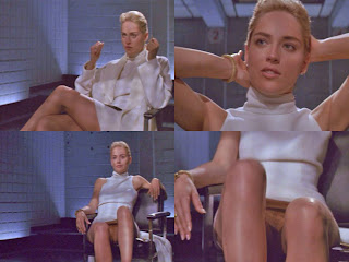
 Whenever I get given project the first thing I do is my research - I can not design unless I am properly informed about the subject matter. Sharon Stone is an actress, model and producer, perhaps best known for her role in Basic Instinct and Casino, for which she won a golden globe. She is someone who may be considered overtly sexual and has on occasions been known to have a tenuous link with the truth. For example, her role playing the bisexual serial killer Catherine Tremell containted a notorious scene where she is being interogated by police offices. She is sitting with her legs crossed, un-cross's them, spreads her legs and reveals she is wearing no underwear, then recrosses them. All whilst smoking a cigarette. She plays it overtly cool, never flinching, a female seeming wholly in control. It was one of the first bits of full-frontal nudity in film history and gained her a certain leval of notority. However, she later denied she was aware of the nudity, saying:

"I knew that we were going to do this leg crossing thing, but i did not think you would see my vagina in the scene - I was shocked".

The director of the film, Joe Eszterhas, said otherwise, stating .."she was fully aware".


This was a repeated pattern over the years, with people such as the Dali Lama claiming she was a liar. She has also stated she is a member of Mensa, although this has not been verified. To get a broader view of Sharon Stone I also collected some other quotes:

"A woman has many faces as she goes through her life. It's like we need more than one hair-do. We have many, many changes in the evolution of our lives. We have, we learn, and we grow; we view life differently, and life views us differently."

"At first it was exhilarating but when I realized it wasn't going away, it became scary and claustrophobic. Fame is a weird thing."

"Ava Gardner was the most beautiful woman in the world, and it's wonderful that she didn't cut up her face. She addressed aging by picking up her chin and receiving the light in a better way. And she looked like a woman. She never tried to look like a girl."

"Before I was a year old I walked and talked and I was even potty trained. When I started going to school I think I got on everyone's nerves because I used to ask adult questions rather than settle for the stuff usually fed to kids."

I wanted my poster to evoke a sort of old hollywood glamour, and even though it was purely typographical, be synonomous with the quoter. In the end, for the poster I choose a typeface called Dream Orphans that I felt wouldnt look out of place in some film credits, and arranged the words as if there were legs crossing over.


For the billboard I kept with the Black and White theme and this time, although not explicity allowed by the brief, added an image. To me, doing a billboard poster about a film star without an image of said film star seemed odd - afterall, film stars careers are wholly based on their images. I there included a sultry looking pose of Sharon, alterend to monochrome, and stated a few facts on the opposite side of the image. I wanted the poster to show the side of Sharon that was perhaps untruthfull.


The t-shirt design, which in the crit someone pointed out would be so much more appropriate on a white pair of underwear, I put the word 'fake' in the middle of the spreadness. This was to make a comment on how sexuality in cinema is quite often the complete opposite of what actual sex is life. Sex on film is impressive - artfully tousled hair, full face of make-up, simultanious multiple orgasms. Sex in real life is real - great, but sometimes funny, and often messy. If we all had a fictional film sex life, I imagine life would be a lot less fraught!

To accompany this project I also made a book that included images of Sharon Stone and various quotes to give a more well rounded view of her.